
Geographic Information Systems (GIS) software is essential for climate scientists who analyze spatial data across global, regional, and local scales. GIS transforms massive climate datasets (from ice core samples to satellite imagery) into visual maps that reveal temperature trends, weather patterns, and ecological changes. Many environmental science graduate programs include GIS coursework, especially in climate or geospatial specializations, and the skill significantly enhances career prospects in climate research, environmental consulting, and policy analysis.
GIS is growing and becoming vital across environmental sciences. Across the public and private sectors, organizations recognize the benefits of digital mapping for climate research, conservation planning, resource management, and infrastructure development. In North America, GIS has been used to plot pipeline routes and coordinate disaster relief efforts. In the UK, it supports major infrastructure projects and climate adaptation strategies. For students entering environmental science fields in 2025, GIS proficiency isn't optional. It's expected.
In This Article
- Why GIS Skills Matter for Climate Science Careers
- Core Applications: How Climate Scientists Use GIS
- Climate Modeling and Future Predictions
- Weather Analysis and Extreme Event Tracking
- Learning GIS: Degree Programs and Career Pathways
- Frequently Asked Questions
- Key Takeaways
If your career path involves any geographic element, you'll likely work with ArcGIS, the industry standard, or QGIS, a powerful free alternative. MapInfo is used in specific business sectors, but is less common in climate science. Here's the practical reality: GIS is a highly transferable skill. Your climate science work with GIS software translates directly to conservation biology, urban planning, environmental health, or resource management if you ever decide to shift focus. For comprehensive information on where and how you can study GIS, explore our GIS degree programs page.
GIS (whether you call it Geographic Information Systems or Geographic Information Science) involves collecting, organizing, and analyzing data that has geographic reference. This data is compiled and processed using specialized software packages for visualization and analysis. GIS specialists need an eye for visuals, technical IT skills, strong communication abilities, and a real grasp of geographic data concepts.
Why GIS Skills Matter for Climate Science Careers
Let's address the question most students ask: "Do I really need to learn GIS?" The honest answer is yes, if you're serious about climate science. Here's why this skill has become non-negotiable.
Climate science graduate programs increasingly expect incoming students to have at least basic GIS literacy. Many undergraduate environmental science degrees now include GIS modules forpreciselyy this reason. Employers in climate research, whether university labs, government agencies like NOAA and EPA, or environmental consulting firms, list GIS proficiency in most job postings.
The practical benefit is straightforward: GIS allows you to work with data the way climate scientists actually encounter it. It's information tied to specific locations, times, and spatial scales. Without GIS skills, you're limited to spreadsheets and statistical software. With GIS, you can visualize how temperature anomalies spread across continents, track hurricane intensification patterns, map deforestation rates, or model sea level rise impacts on coastal communities.
Beyond career necessity, GIS provides intellectual clarity. Climate data is inherently spatial. When you can see patterns on a map rather than staring at columns of numbers, you understand the science more deeply. You catch anomalies faster. You communicate findings more effectively to non-technical audiences, policymakers, journalists, and community stakeholders who need visual evidence to support climate action.
Core Applications: How Climate Scientists Use GIS
Climate scientists work with massive datasets daily. They process temperature readings from thousands of weather stations, chemical analyses from ice cores, and satellite measurements covering entire regions. GIS software transforms this overwhelming information into something manageable and meaningful. Here's how professionals actually use these tools in their research.
Paleoclimate Reconstruction
Researchers studying Earth's climate history use GIS to organize spatial data across time periods. For example, paleoenvironmental scientists analyzing gases extracted from Antarctic ice cores compile their findings across geographic areas, different drilling sites, and various timeframes at the exact location. Ice core data helps us reconstruct atmospheric composition going back 800,000 years, but only when properly organized and visualized through GIS mapping.
This application extends to other paleoclimate proxies, including tree ring data, lake sediment cores, coral reef growth patterns, and fossil pollen records. Each data source tells us something about past climate conditions in specific locations. GIS allows researchers to integrate these disparate sources into comprehensive spatial models of historical climate patterns.
Temperature Trend Analysis
Calculating average global temperatures. Or regional temperature changes, which require processing millions of measurements from weather stations, ocean buoys, and satellite sensors. GIS helps climate scientists plot these changes over decades, highlighting geographic areas where warming exceeds global averages or where unexpected cooling occurs.
This spatial analysis reveals critical patterns. We now know the Arctic is warming roughly twice as fast as the global average. We've identified urban heat islands where cities experience higher temperatures than surrounding rural areas. We've mapped ocean temperature anomalies that predict El Niño events months in advance. None of this analysis would be possible without GIS visualization and spatial statistics tools.
Separating Natural and Human-Caused Factors
Climate researchers need to distinguish natural climate variations, including solar cycles, volcanic eruptions, and ocean circulation patterns, from human-caused greenhouse gas emissions. GIS helps separate these "atmospheric forcings" by allowing scientists to map and analyze each factor's geographic fingerprint.
Volcanic eruptions, for instance, create distinct cooling patterns in specific hemispheres or latitudes. El Niño and La Niña events follow predictable spatial patterns across the Pacific Ocean and adjacent continents. By mapping these natural variations separately, researchers can identify the remaining signal: human-caused warming from fossil fuel emissions and land use changes.
Ecosystem and Biodiversity Monitoring
Population growth and land use changes profoundly affect local and regional climates. GIS allows climate scientists to visualize how urban expansion, deforestation, agricultural intensification, and habitat fragmentation alter temperature patterns, water cycles, and carbon storage.
The loss of biodiversity(both plant and animal species) creates feedback loops that accelerate climate change. Deforestation in the Amazon reduces rainfall across South America. Wetland destruction eliminates carbon sinks and increases flood risk. GIS maps make these connections visible to researchers, policymakers, and the public. We can literally see how a new highway through a forest fragment affects temperature, precipitation, and species migration patterns.
| Climate Science Specialization | Primary GIS Applications | Typical Data Sources |
|---|---|---|
| Paleoclimatology | Ice core analysis, mapping, historical temperature reconstruction, and vegetation pattern modeling | Ice cores, tree rings, lake sediments, pollen records |
| Atmospheric Science | Weather pattern tracking, storm system analysis, and air quality monitoring | Weather stations, satellite imagery, and radar data |
| Ocean & Marine Climate | Sea surface temperature mapping, ocean current modeling, coastal vulnerability assessment | Buoy networks, satellite altimetry, ship-based measurements |
| Ecology & Conservation | Habitat mapping, species migration tracking, and biodiversity hotspot identification | Field surveys, camera traps, and satellite land cover data |
| Climate Modeling | Future scenario visualization, regional impact assessment, and downscaling global models | Climate model outputs, emissions scenarios, socioeconomic projections |
Climate Modeling and Future Predictions
The widespread availability of climate modeling data has fundamentally changed how we understand and communicate climate science. Organizations like the National Center for Atmospheric Research (NCAR) provide GIS-ready datasets (often as "shapefiles") that researchers worldwide can access and analyze. Digital mapping has always been well-suited to understanding climate systems, carrying forward the cartographic tradition that predates modern computing.
But climate modeling goes beyond mapping current conditions. How can GIS help predict future changes to global temperatures, sea level rise, ecosystem shifts, and extreme weather patterns? By combining historical data with current observations, we build increasingly accurate projections about what Earth's climate may look like decades or centuries from now.
Climate models integrate many data layers: greenhouse gas concentrations, ocean circulation patterns, ice sheet dynamics, vegetation cover, cloud formation processes, and more. GIS systems organize this complexity, allowing researchers to visualize how changes in one system (say, Arctic sea ice loss) cascade through others (altered jet stream patterns, changing rainfall in mid-latitudes).
These GIS-based climate models give us our clearest picture of Earth's climate health. Organizations like the Intergovernmental Panel on Climate Change (IPCC) make much of this data publicly available, even for those without specialized GIS training. Visual maps, especially color-coded temperature and precipitation projections) communicate climate science more effectively than any other medium. When we can show policymakers and the public what "2�C warming" means for their specific region, state, or city, the abstract becomes concrete.
For students and prospective climate scientists, understanding how to work with these models matters. Graduate research often involves taking global climate model outputs and "downscaling" them to regional or local scales using GIS tools. You might project how climate change will affect water availability in a specific river basin, or model where new disease vectors might emerge as temperatures warm. These applications require comfort with both climate science concepts and GIS technical skills.
Weather Analysis and Extreme Event Tracking
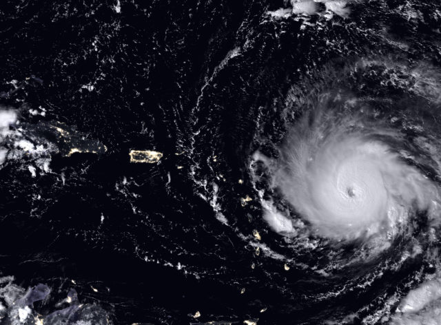
Extreme weather events, including intense hurricanes, prolonged droughts, devastating floods, heat waves, and unusual cold snaps) are becoming more frequent and severe as global temperatures rise. GIS applications are fundamental to tracking these events globally, understanding their interconnections, and predicting their impacts on vulnerable communities.
Weather systems don't exist in isolation. A single atmospheric pattern can create cascading effects across entire hemispheres. Consider recent examples: atmospheric rivers bringing record rainfall to California after years of drought, unprecedented heat domes across the Pacific Northwest, or rapid Arctic warming influencing winter weather patterns across North America and Europe.
In 2024, the United States experienced multiple billion-dollar weather disasters, from Hurricane Helene's devastating inland flooding to intense wildfire seasons across the West. Australia continues facing record-breaking heat and bushfire seasons that stretch fire response resources to their limits. Climate scientists project that firefighting personnel's needs may triple by 2035. Predicting where fires will occur, what the impacts will be, and what resources communities need for resilience. These are major GIS-driven research projects.
Where extreme weather is concerned, GIS enables us to handle enormous datasets and compare information across organizations, borders, and timeframes. Making global climate data accessible helps build a comprehensive picture of worldwide patterns. We can trace how a heat wave in one region influences drought conditions elsewhere weeks or months later. This integrated view, which was impossible before GIS technology) now drives emergency preparedness planning and climate adaptation strategies.
For aspiring climatologists and climate scientists, extreme-weather analysis is a growing specialty. You might work with emergency management agencies mapping flood risk zones, with insurance companies assessing climate-related hazards, or with urban planners designing heat-resilient cities. All of these applications require strong GIS skills combined with climate science knowledge.
Learning GIS: Degree Programs and Career Pathways
Now that you understand why GIS matters for climate science, let's address the practical question: how do you actually learn these skills?
Undergraduate Foundation
Many environmental science bachelor's programs now include at least one GIS course, typically in your sophomore or junior year. Some schools offer GIS as an elective or minor concentration alongside your environmental science major. This undergraduate exposure gives you essential foundational skills: understanding coordinate systems, working with layers, creating basic maps, and performing spatial analysis.
If your current program doesn't require GIS, take it as an elective anyway. The skill significantly enhances your prospects for graduate school applications and summer internships. Research labs want undergraduates who can contribute immediately rather than needing months of training. Environmental consulting firms seeking summer interns specifically request GIS experience in most postings.
When selecting undergraduate courses, look for programs that teach industry-standard software. ArcGIS dominates academic and professional climate science settings, so prioritize programs using this platform. Many universities offer free or deeply discounted educational licenses, allowing you to build a portfolio before entering the job market.
Graduate-Level Expertise
Many climate science graduate programs, particularly those focused on geospatial analysis, modeling, or applied research) include multiple GIS courses or assume you enter with basic GIS literacy. Advanced coursework covers spatial statistics, remote sensing image analysis, climate model downscaling, and specialized applications such as geocomputation and spatial optimization. Requirements vary significantly between programs, so check specific curricula when comparing graduate schools.
Some universities offer dedicated GIS graduate degrees or certificates that you can pursue alongside studies in environmental science. These focused programs appeal to students planning careers as GIS specialists supporting climate research teams, or those wanting strong technical credentials for competitive research positions.
Graduate research projects almost always involve GIS. Whether you're studying coastal vulnerability to sea level rise, modeling species range shifts under climate change, or analyzing urban heat island effects, you'll use GIS extensively. Most advisors expect students to learn additional GIS techniques independently as their research demands.
Continuing Education and Certificates
If you're already working in an environmental field and want to add GIS skills, several paths exist. Many universities offer online GIS certificate programs designed for working professionals. Esri (the company behind ArcGIS) provides extensive online training courses, some free and others reasonably priced. Professional workshops at conferences or through professional organizations give you hands-on experience with specific GIS techniques relevant to climate science.
The key is consistent practice. GIS proficiency develops through regular use, not one-time coursework. Working on personal projects, such as mapping local climate data, analyzing your region's temperature trends, and creating visualizations from publicly available datasets. builds skills and portfolio pieces that demonstrate expertise to future employers.
| Software Platform | Best For | Learning Curve | Cost Considerations |
|---|---|---|---|
| ArcGIS (Esri) | Academic research, government agencies, comprehensive climate analysis, and industry standards for environmental science | Moderate - Extensive documentation and tutorials available | Educational licenses are available, free for students at many universities, and expensive for commercial use |
| QGIS (Open Source) | Budget-conscious users, open-source projects, and international development work | Moderate - Large user community; many free learning resources | Completely free; no licensing fees ever |
| MapInfo Pro | Business intelligence, location analytics, and some UK/European institutions | Moderate - Smaller user base than ArcGIS | Commercial licensing; educational discounts available |
| Google Earth Engine | Large-scale satellite imagery analysis, cloud-based processing, time-series analysis | Steeper - Requires programming knowledge (JavaScript or Python) | Free for research and education; programming skills required |
Career Pathways with Climate Science GIS Skills
What careers actually use climate science GIS expertise? More than you might expect. Beyond traditional climate research positions, consider these pathways:
Research Institutions and Universities: Climate research labs, oceanographic institutes, and university environmental science departments employ GIS specialists who support multiple research projects. These positions often involve managing spatial databases, creating publication-quality maps, and training graduate students in GIS techniques.
Government Agencies: NOAA, EPA, NASA, USGS, state environmental agencies, and local planning departments all need climate scientists with GIS skills. You might map climate vulnerabilities for coastal communities, assess environmental impacts of proposed developments, or track ecosystem changes over time.
Environmental Consulting: Private consulting firms help clients comply with environmental regulations, assess climate risks, and plan adaptation strategies. GIS-skilled climate scientists are valuable because they can conduct spatial analysis and communicate findings to non-technical clients.
Non-Profit Conservation: Organizations such as The Nature Conservancy, World Wildlife Fund, and regional land trusts extensively use GIS for conservation planning, monitoring habitat quality, and demonstrating program impacts to donors and stakeholders.
Climate Tech and Private Sector: Growing industries around renewable energy, climate risk assessment, agricultural technology, and sustainability planning need professionals who understand both climate science and spatial analysis. These roles often pay well and offer career growth beyond traditional academic paths.
Frequently Asked Questions
Do I need to learn GIS to work in climate science?
While not every climate science role requires GIS expertise, the skill has become increasingly valuable. Most climate research positions expect at least basic GIS proficiency for mapping temperature data, analyzing spatial patterns, and visualizing climate models. If you're pursuing graduate studies in environmental science, climatology, or related fields, you'll likely encounter GIS in your coursework and research. The question isn't whether you need GIS. It's how much GIS you need for your specific career goals.
What's the difference between GIS and climate modeling software?
Climate modeling software runs complex simulations predicting future conditions based on atmospheric physics, ocean dynamics, and biogeochemical cycles. These models require supercomputers and specialized programming. GIS software focuses on organizing, analyzing, and visualizing geographic data. It's the tool you use to display and interpret model outputs. Climate scientists typically use both: modeling software generates predictions, while GIS displays those predictions on maps and analyzes how changes vary across regions, time periods, and scenarios.
Should I study GIS as an undergraduate or wait until graduate school?
Take at least one GIS course as an undergraduate. Many environmental science bachelor's programs now include GIS modules, and the skill applies across multiple career paths, including ecology, conservation, urban planning, and environmental consulting. Starting early helps you determine if GIS-focused roles interest you before committing to graduate specialization. Strong undergraduate GIS experience also strengthens your graduate school applications and opens doors to better research assistantships and summer internships.
What GIS software do climate scientists typically use?
ArcGIS dominates academic research and government agency climate science work, making it the industry standard most university programs teach. QGIS, a free open-source alternative, is rapidly gaining adoption and offers powerful capabilities for students and professionals on tight budgets. Google Earth Engine is increasingly essential for large-scale satellite data analysis, but requires programming skills. MapInfo maintainsa presence in specific business sectors but is less common in climate science. Focus on learning ArcGIS first for traditional career paths, but consider QGIS if cost is a barrier or you're interested in open-source workflows.
Can GIS skills help me transition from another field into climate science?
Absolutely. GIS is one of the most transferable technical skills in environmental work. If you have a background in geography, urban planning, engineering, data science, or computer science, adding climate-specific GIS expertise can open doors to research positions, consulting roles, or government agencies. Many successful climate scientists entered the field through GIS specialization rather than traditional environmental science degrees. The combination of technical GIS skills and domain knowledge from your previous field creates valuable career niches. Think climate risk analysis for infrastructure planning, or agricultural adaptation modeling for food security.
Key Takeaways
- Essential Career Skill: GIS proficiency has evolved from optional to expected in most climate science roles, particularly in research institutions, government agencies, and environmental consulting. The ability to visualize complex spatial datasets sets you apart in competitive job markets and enhances your effectiveness as a researcher or practitioner.
- Undergraduate Foundation Matters: Many environmental science programs include at least one GIS module at the bachelor's level. While advanced climate modeling may require graduate-level GIS coursework, building foundational skills early provides significant career flexibility across environmental fields and strengthens graduate school applications.
- Data Visualization Power: Climate scientists use GIS to transform abstract data, including temperature readings, ice core chemistry, satellite measurements, and model outputs, into visual maps that reveal patterns, trends, and regional variations. This capability is fundamental to communicating climate research effectively to policymakers, journalists, and the public who need visual evidence to understand complex climate phenomena.
- Transferable Expertise: GIS skills learned for climate applications transfer directly to ecology, conservation planning, environmental planning, urban development, resource management, environmental health, and disaster preparedness. This versatility provides career security even if your specific focus area shifts over time, making GIS one of the most valuable skills for long-term career resilience.
- Industry-Standard Software: ArcGIS dominates academic and professional climate research settings, while QGIS is emerging as a powerful, free alternative, gaining rapid adoption. Most university programs still teach ArcGIS, and educational licenses make it accessible for students building portfolios and practical experience before entering the job market. Learning ArcGIS opens the most doors for traditional climate science careers, while QGIS offers a viable path for budget-conscious students or those who prefer open-source tools.
Ready to build essential GIS skills for your climate science career? Explore accredited degree programs that integrate Geographic Information Systems training with environmental science coursework.
Related Degrees
Sources
- http://www.esri.com/industries/environment
- Longley, P.A., Goodchild, M.F., Maguire, D.J. & Rhind, D.W. 2011: Geographic Information Systems & Science (Third Edition). Wiley: Hoboken, New Jersey
- http://gis.ncdc.noaa.gov/map/viewer/#app=cdo&cfg=paleo&theme=paleo&node=gis
- http://www.esrl.noaa.gov/psd/data/gridded/data.mlost.html
- http://blogs.scientificamerican.com/observations/2015/01/15/humans-cross-another-danger-line-for-the-planet/?WT.mc_id=SA_Facebook
- http://www.esri.com/library/ebooks/climate-change.pdf
- https://gisclimatechange.ucar.edu/
- http://blogs.esri.com/esri/esri-insider/2013/11/08/the-climate-change-gis-connection/
- http://www.esri.com/library/brochures/pdfs/gis-for-green-government.pdf
- http://www.esri.com/library/bestpractices/climate-change.pdf
- http://blogs.esri.com/esri/esri-insider/2013/11/08/the-climate-change-gis-connection/
- https://archive.thinkprogress.org/siberia-is-already-experiencing-mid-summer-temperatures-and-major-wildfires-5e15bd783834/
- https://gis.ucar.edu/projects/extreme-weather-application
- http://blogs.esri.com/esri/esri-insider/2015/01/21/what-is-up-with-the-weather/
- What Is Parasitology? The Science of Parasites Explained - November 19, 2018
- Desert Ecosystems: Types, Ecology, and Global Importance - November 19, 2018
- Conservation: History and Future - September 14, 2018
Related Articles


Featured Article
What is Meteorology? The Science of Weather and Climate